How to: Make a research poster
This subject update provides tips on how to make a successful poster. Posters are widely used in the academic community to present research. Posters serve two main purposes: to provide visuals and text to support the presentation of your work; and to attract an audience.
Because you are limited to one poster, you must be succinct in your descriptions and carefully design figures to highlight your findings. At a conference, the researcher stands by the poster and helps to elaborate on the research and answer any questions people might have. Thus, posters must also be attractive and organised so that information is easy to discuss and follow.

Getting started
Decide the primary finding you want to highlight from your research
Think about how you can share that finding with your audience. What kind of visuals do you need? What will you say orally in the presentation of your work?
Define the audience
Will the audience be primarily your peers, teachers, or other adults? How much background knowledge is your audience likely to have? Keeping your audience in mind from the start helps to get your message across to different people who will visit your poster.
Determine how you will be producing your poster
This may be specified for you based on resources available to you and your school. Will you produce the poster electronically on a computer then print? Will it be one large printed poster or will you be adhering printed paper to a large poster board?
Make sure your poster is the correct size
This is usually specified for you. Common poster sizes are A0, A1 or 36” x 48”. If you’re using software, make sure you start with the correct size document, for example you may need to change the size of a PowerPoint slide.
Determine the poster orientation: landscape or portrait
This may be specified for you. If it’s not, consider the types of figures you’ll likely want on the poster and how they may fit on the poster.
Drafting the content
Sketch out a general layout
Take a few minutes to layout sections of your poster on a piece of scratch paper. A typical research poster will have the following sections (see the example poster above):
- Title
- Name of the author(s) and affiliation, i.e. school name
- Introduction / background, including objectives of the research
- Methods (sometimes omitted)
- Results and analysis, including graphs, charts, tables and other figures
- Conclusion
- Acknowledgements (sometimes omitted)
Draft sections in a word processor
Consider drafting your text for the different sections in a word processor, such as Microsoft Office, and copying and pasting your final text into text boxes on your poster. You’ll avoid being distracted by the temptation to play with colours or object sizing.
Be concise
Total word count on your poster will probably be 300-800 words.
Use bullets and numbered lists
Lists can help make the poster easier to read.
Make effective use of figures
If a graph or chart can communicate your point opt to make a figure over a text-heavy paragraph or table. Make sure figures have appropriate titles, axis labels, and keys so they are easy to interpret.
Refining the details of a good visual poster
All text should be large enough to read from 2 metres away
The following font sizes are general rules of thumb:
- Title: 72pt +
- Authors: 48pt +
- Headings: 36pt +
- Body text: 24pt +
- Captions / subtext: 18pt +
Stick with an easy to read font
This is especially important for all of the body text. Font recommendations include sans-serif fonts such as Arial, Helvetica, or Veranda and serif-fonts such as Garamond or Times New Roman.
Choose colours carefully
Colours are a great way to attract people’s attention. However, too many colours can be distracting. Also, be aware that screen colours do not always translate exactly to print, so don’t become too attached to an exact colour shade.
Contrast is important
Make sure you have a strong contrast between your text colour and background colour to make reading easy. Be especially careful if you choose a colour gradient for your background. (If you’re printing your poster, you may want to check whether you can have a coloured background.)
Everything should align to something
Make use of alignment tools available, such as rulers, grids, or guides, to make your poster neat!
Empty space is important
A crowded poster is difficult to read. Use empty space to visually separate sections of your poster. You’ll likely end up with a poster that is about 1/3 text, 1/3 graphics, and 1/3 empty space.
Figures
Make sure figures have appropriate titles, axis labels, and keys so they are easy to interpret. Include captions as appropriate to clarify the purpose of the figure. Conventionally, captions appear below graphs, charts, and images, but above tables.
Images
Good use of images can make or break your poster.
- Use high resolution images.
- Be careful when resizing images that they don’t become warped or pixelated. You can hold down the shift key as you drag an edge to proportionally resize an image. Use the zoom in and out function to check if the image looks right.
- Make a folder with your images in case you need to replace them at a later point.
Proofread
And proofread again. This can be the difference in making your poster look professional. It may help to read the content of your poster aloud.
Top tips
Get started early!
If you complete your poster early, you have an opportunity to show a draft to a peer or expert to get feedback. This can help make sure your poster is appropriately attractive and accessible to your audience.
Plan your poster sections and your layout.
Draft your text and make your figures. Then make your poster and adjust style. It’s easy to get caught up in how your poster looks, but don’t forget you must have content for your poster to showcase.
Print a ‘mini’ draft poster before printing
If you will be printing a big poster, print a scaled draft of your poster before sending off the final poster. This can be a good way ‘to see the whole picture’ and catch things you didn’t notice on screen.
Zoom in and out to check the details
Use the zoom function of your creation software to check that figures and images all look sharp.
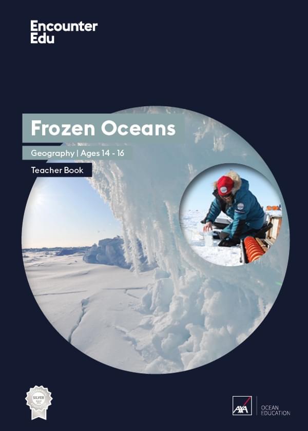
Geography | Ages 14-16
Frozen Oceans
This Frozen Oceans education resource includes two data case studies that introduce students to ocean acidification and sea ice thickness. The core of each case study are data sets from real expeditions.
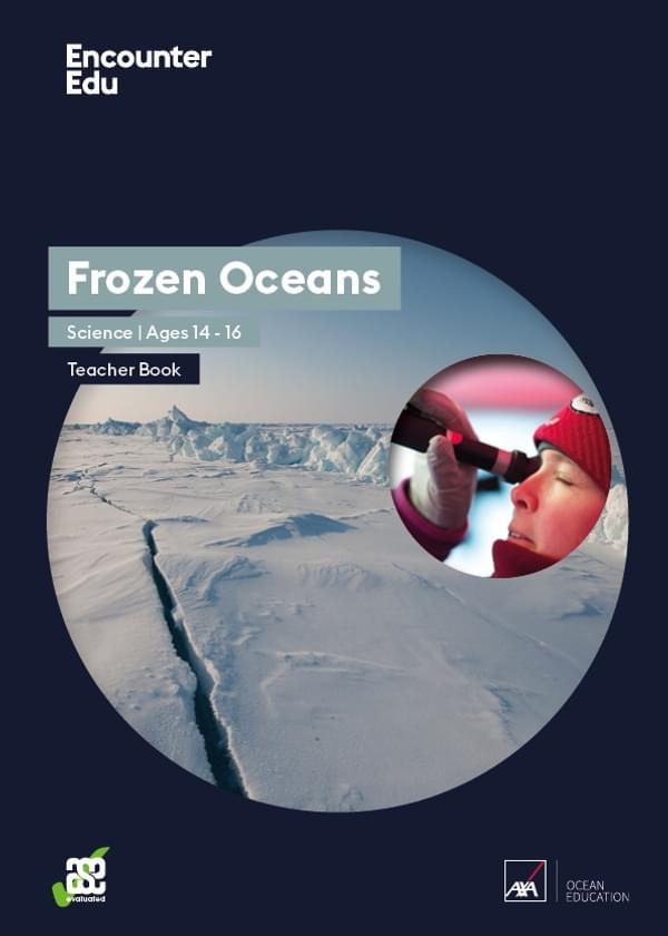
Science | Ages 14-16
Frozen Oceans
This Frozen Oceans unit outlines the research carried out by the Catlin Arctic Surveys and can be used in teaching the carbon cycle, ocean acidification and its impact on the Arctic ecosystem.